Device Customization Guide
Learn how to customize your devices with screen content and colors to create perfect iPhone mockups, iPad mockups, and more.
Adding Screen Content
Create professional iPhone mockups and iPad mockups by uploading your designs using the recommended dimensions for perfect display quality.
Uploading Images
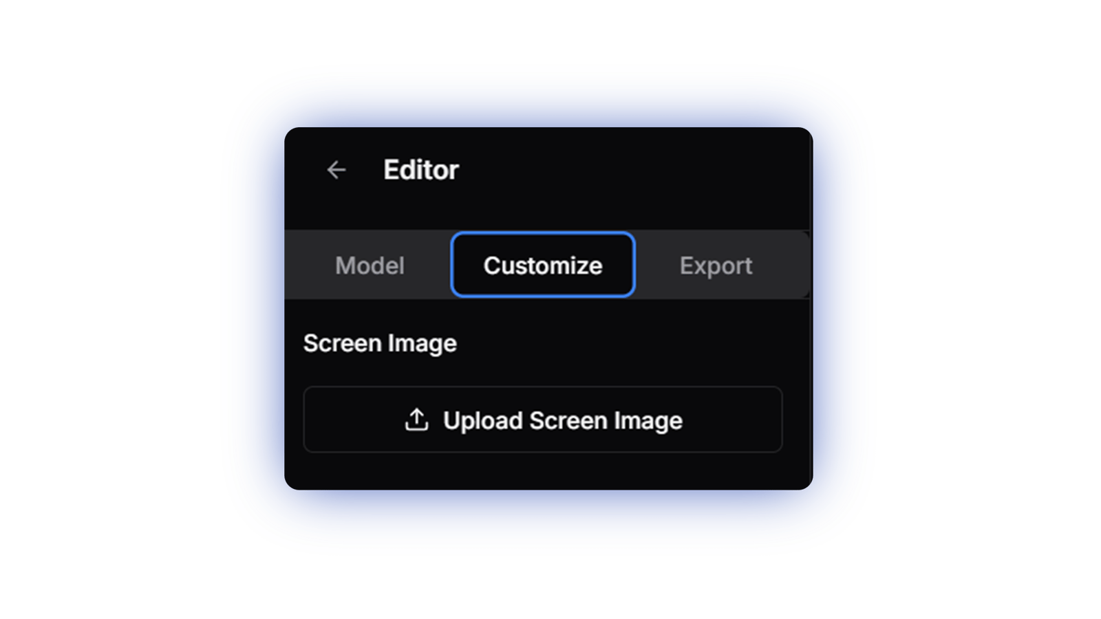
Click the customize tab in the sidebar to open the image upload panel. Each device displays its recommended dimensions and aspect ratio in the model tab. Follow these guidelines for the best results.

Screen Content Tips
Contrast & Visibility
Ensure your designs have sufficient contrast. Text and UI elements should remain clear and readable in the final mockup.
Scale Considerations
Text and important elements should be sized appropriately. Remember that mockups are often viewed at different scales.
Content Placement
Position key content away from device edges and corners where possible for better visibility in the final composition.
Color Customization
Customize device colors to match your brand or create striking visual combinations.
Device Colors
Use the color picker to customize different parts of your device. Available options vary by device model, including body color, frame color, and more.

Background Color
Set a background color to help visualize your scene during composition. The background is removed automatically in the final export for maximum flexibility.

Screen Content Guide
Understanding aspect ratios, dimensions, and orientation is crucial for perfect screen content display.
Device Orientation
Portrait & Landscape
When creating iPhone mockups or iPad mockups, you can switch between portrait and landscape orientations:
• Flip your image dimensions (e.g., 1000x2000 becomes 2000x1000)
• Upload a new image with the correct orientation
• The device will rotate counter-clockwise
Supported Devices
Create stunning mockups for:
• iPhone mockups in both orientations
• iPad mockups with flexible display options
• Other mobile devices
Common Aspect Ratios
16.5:9 (Ultra-wide)
Common in modern ultrawide displays
• 1980 × 1080
• 3300 × 1800
16:10 (MacBook)
Standard for MacBook displays
• 1440 × 900
• 2560 × 1600
16:9 (Standard)
Common in monitors and TVs
• 1920 × 1080
• 2560 × 1440
Pro Tips
Perfect Ratios
Always match the exact aspect ratio of your target device. Even small mismatches can lead to stretching or cropping.
Resolution Tips
Export your designs at 2x the base dimensions for optimal clarity. Our high-resolution exports will ensure your mockups look crisp.
Quick Math
To calculate dimensions: multiply both width and height by the same number to maintain the aspect ratio (e.g., 16:9 → 1920:1080 → 2560:1440).
Quick Reference
Screen Image Requirements
- • Format: PNG or JPEG
- • Max size: 10MB
- • Resolution: Follow device-specific recommendations
- • Aspect ratio: Must match device exactly
Aspect Ratio Calculator
- • 16.5:9 → multiply both by 60 → 990:540
- • 16:10 → multiply both by 80 → 1280:800
- • 16:9 → multiply both by 60 → 960:540